Transform your photography into vibrant, tactile art through risograph printing, a unique blend of analog charm and digital precision among modern photographic printing techniques. Born in Japan and embraced by artists worldwide, this eco-friendly printing method creates distinctive layers of spot colors, delivering prints with unmatched depth and character. Each risograph print tells a story through its signature imperfections – slight misregistrations, subtle dot patterns, and luminous soy-based inks that conventional printing simply cannot replicate. Whether you’re a fine art photographer seeking to stand out in galleries or a commercial artist looking to infuse your work with authentic vintage appeal, risograph printing offers a compelling alternative to traditional reproduction methods. The process combines the raw authenticity of screenprinting with the efficiency of digital workflows, opening new creative possibilities for photographers who dare to experiment beyond the conventional.
What Makes Risograph Printing Special for Photographers
The Distinctive Aesthetic
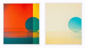
The magic of risograph printing lies in its distinctive layered approach, setting it apart from other alternative printing methods. Each color in a risograph print is laid down separately, creating a unique interaction between layers that gives photographs a characteristic depth and vibrancy. The process embraces imperfections, producing slight misalignments and texture variations that add character to each print.
The color palette, while limited to specific ink colors, creates unexpected and beautiful combinations. When layers overlap, they produce secondary colors with a distinctive grainy quality that’s become highly sought-after in contemporary art and design. The slight dot patterns and subtle variations in ink density contribute to a organic, handmade feel that digital printing simply cannot replicate.
What makes risograph prints truly special is their semi-transparent nature. Each ink layer allows light to interact differently, creating a subtle shimmer effect that changes depending on viewing angle. These natural inconsistencies and “happy accidents” in registration make each print unique, even within the same edition, giving photographers a way to add an authentic, artistic touch to their work.
Environmental Benefits
Risograph printing stands out as an environmentally conscious choice in the world of photographic reproduction. Unlike traditional photo printing methods that often rely on chemical-heavy processes and generate substantial waste, riso printing uses eco-friendly soy-based inks and biodegradable masters. The printing process consumes significantly less energy compared to conventional digital printers, as it operates at room temperature without the need for heat or laser technology.
The master sheets used in risograph printing are made from banana fiber paper, a renewable resource that breaks down naturally. Each ink drum can produce thousands of prints before needing replacement, reducing waste compared to traditional inkjet cartridges. The soy-based inks are also more sustainable than petroleum-based alternatives, producing vibrant colors while maintaining a smaller environmental footprint.
Additionally, risograph printers are designed for easy maintenance and long-term use, with replaceable parts that extend their lifespan. This durability, combined with their minimal energy consumption and natural materials, makes riso printing an attractive option for environmentally conscious photographers and artists looking to reduce their carbon footprint while creating distinctive prints.
Technical Considerations for Risograph Photo Printing
Color Separation and Layers
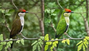
Preparing images for risograph printing requires a thoughtful approach to color separation, as each color is printed individually in layers. Unlike traditional CMYK printing, risograph uses spot colors, with each color requiring its own master stencil.
Start by selecting your color palette from the available risograph inks. Popular choices include fluorescent pink, blue, yellow, and green. Your image will need to be separated into different layers corresponding to these colors. Professional image editing software like Photoshop can help you create these separations using channels or layers.
When separating colors, consider how they will interact when printed. Risograph inks are semi-transparent, allowing for interesting color combinations when overlapped. For example, blue and yellow layers can create green areas, while pink and blue can produce purple tones. Keep in mind that not all colors mix predictably, so it’s worth experimenting with test prints.
Pay special attention to the order of your layers, as this affects the final result. Generally, lighter colors should be printed first, with darker colors on top. Maintain proper registration marks on each layer to ensure accurate alignment during printing. For best results, convert your image to grayscale versions for each color layer, adjusting the contrast and brightness to achieve desired intensity levels.
Remember that slight misregistration is part of the risograph charm, so embrace these imperfections as they add character to your prints.
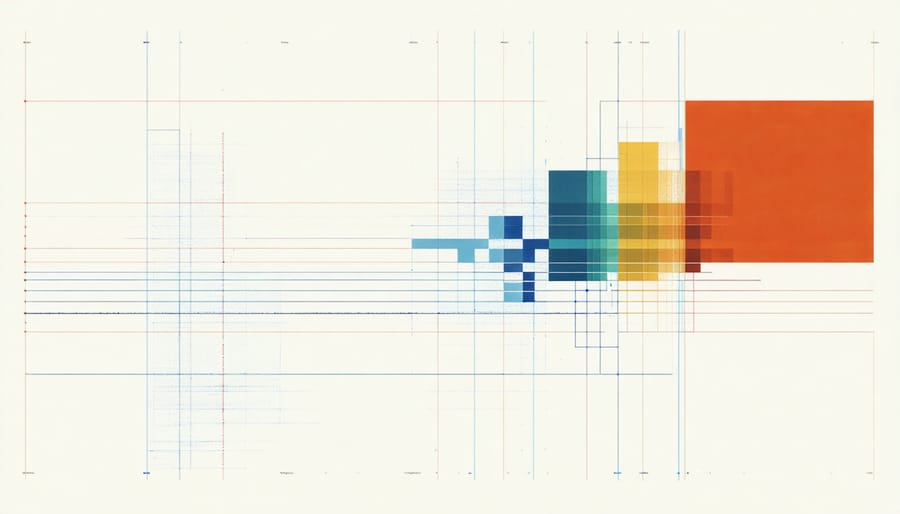
Image Preparation
Preparing images for risograph printing requires specific attention to detail to achieve optimal print quality. Start by ensuring your digital images are in RGB format, even though they’ll eventually be separated into spot colors. Set your resolution to 300 DPI for sharp results, and remember that risograph printing has a minimum dot size that affects detail reproduction.
Establish a consistent image preparation workflow by adjusting your contrast and brightness levels slightly higher than normal, as risograph prints tend to flatten mid-tones. Pay special attention to your image’s histogram, ensuring there’s good separation between shadows and highlights.
Convert your photos to grayscale if you’re planning single-color prints, or prepare separate color channels for multi-color work. When working with color, remember that risograph inks are semi-transparent, so overlapping colors will create new hues. Adjust your color balance keeping in mind that risograph inks have their own unique characteristics and may not exactly match your screen display.
Save your files in TIFF or high-quality PDF format to preserve maximum detail. Avoid heavy compression, as this can create artifacts that become more noticeable in the final print. If possible, test your adjustments with small proof prints before committing to larger runs.
Paper Selection
Paper selection plays a crucial role in risograph printing, significantly influencing the final look and feel of your photographic prints. Unlike traditional photo paper, risograph printing works best with uncoated, natural fiber papers that can properly absorb the soy-based inks.
The most popular choices include recycled papers, kraft papers, and Japanese washi, which all offer unique textures and printing characteristics. Recycled papers tend to create a subtle, matte finish that enhances the signature risograph aesthetic, while kraft papers add warmth and an organic quality to your images. Washi paper, with its delicate fibers, produces prints with exceptional depth and character.
Paper weight is another crucial consideration. Papers between 80-250gsm typically work best, with 120gsm being the sweet spot for most photographic prints. Heavier papers can cause registration issues, while lighter ones might wrinkle or show through on the reverse side.
The paper’s color also affects your final print. While white is standard, cream or off-white papers can add a vintage warmth to your images. Some artists deliberately choose colored papers to create unique effects, though this requires careful consideration of how your chosen ink colors will interact with the base paper tone.
Remember that paper texture impacts ink absorption and dot pattern visibility. Smoother papers showcase fine details better, while textured papers create a more artistic, painterly effect.
Creative Applications and Tips
Achieving Different Styles
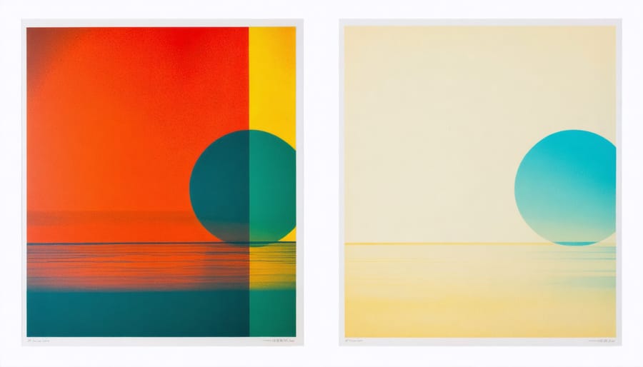
Risograph printing offers a unique playground for photographers looking to experiment with different artistic styles through strategic color layering and combinations. The secret lies in understanding how different drum colors interact and overlap to create distinctive visual effects.
For a vintage aesthetic, try combining warm tones like bright red and yellow. This combination creates a nostalgic feel reminiscent of old movie posters and concert flyers. Adding fluorescent pink as a third layer can introduce an unexpected contemporary twist while maintaining that retro charm.
To achieve a more dramatic look, experiment with dark blues and blacks as base layers, then overlay with lighter colors like mint green or medium blue. This technique creates depth and dimension, particularly effective for architectural photography or moody portraits. The slightly misaligned registration characteristic of riso printing adds an organic, handmade quality to these combinations.
Natural imagery benefits from earthy color combinations. Try using forest green as a base layer, followed by brown or burgundy. The slight imperfections in ink coverage create a textured effect that’s particularly striking in landscape photography.
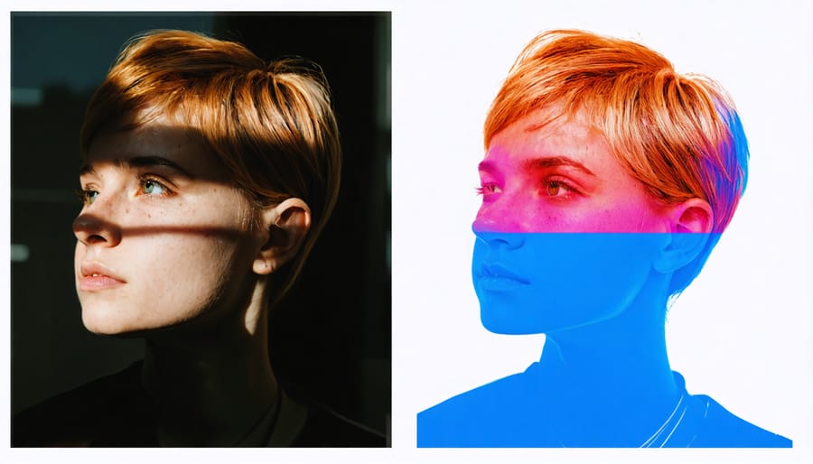
For abstract interpretations of your photographs, consider splitting your image into multiple color channels and printing them slightly offset from each other. This technique creates a psychedelic effect that works especially well with portrait photography or urban scenes.
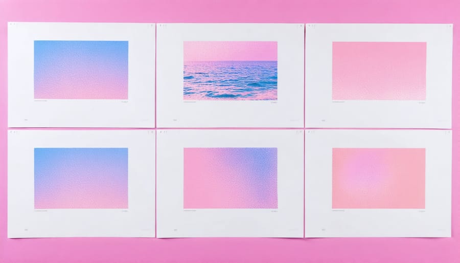
Don’t be afraid to experiment with opacity levels. Printing the same image in different colors at varying opacities can create subtle ghost-like effects that add depth and intrigue to your prints. Remember that each color layer builds upon the previous one, so planning your color sequence is crucial for achieving your desired style.
Common Pitfalls and Solutions
While risograph printing can yield stunning photographic results, several common challenges can affect your final prints. One of the most frequent issues is color registration problems, where different ink layers don’t align perfectly. To minimize this, work with designs that embrace slight misalignment as part of the aesthetic, or include small registration marks in your files to help printers achieve better alignment.
Image resolution can be another stumbling block. Since risograph printing uses a screen-like pattern, photographs with too much detail might appear grainy or lose subtle gradations. Combat this by adjusting your image’s contrast and possibly simplifying complex areas before printing. Aim for images with clear, distinct areas of light and shadow rather than ultra-fine details.
Paper choice frequently trips up newcomers. Not all papers work well with risograph inks – some may cause smearing or poor ink absorption. Stick to uncoated, medium-weight papers (around 80-160gsm) for best results. Avoid glossy stocks entirely, as the ink won’t adhere properly.
Ink bleeding and oversaturation can occur when using multiple layers. To prevent this, allow adequate drying time between colors and avoid overlapping more than two or three inks in any area. Consider the order of your color layers carefully – typically, printing lighter colors first yields better results.
Finally, many photographers struggle with color accuracy expectations. Remember that risograph printing isn’t meant to perfectly reproduce photographic colors. Instead of fighting this limitation, embrace the unique color palette available and plan your images around these constraints. Consider it an opportunity to reimagine your photographs in a new visual language.
Finding Risograph Printing Services
Finding a reliable risograph printing service for your photography work might take some research, but the unique results are worth the effort. Many independent print shops, art centers, and universities now offer risograph printing services, particularly in urban creative hubs.
Start by checking local art print shops in your area, as many have added risograph printers to their equipment lineup. Art schools and community print studios often maintain risograph facilities that are open to the public. Online directories and social media platforms, especially Instagram, can help you discover risograph printers showcasing their work and services.
When selecting a print service, consider these key factors:
Experience with photographic work is crucial, as not all risograph printers regularly handle photographs. Look for examples of their previous photo prints and ask about their experience with halftone screening and color separation specifically for photographic works.
Print quality consistency varies between shops, so request sample prints before committing to a large order. Pay attention to how well they maintain their equipment and handle registration between color layers.
Color options can differ significantly between providers. Ask about their available ink colors and how they approach color matching. Some shops might have limited color drums, while others offer extensive options.
Price points vary widely, but expect to pay more than traditional digital printing, especially for multi-color works. Many shops offer bulk discounts, so inquire about pricing tiers if you’re planning a series or edition.
Technical support is invaluable, particularly if you’re new to risograph printing. Look for printers who are willing to discuss file preparation, color separation, and provide guidance on achieving your desired results. The best providers will help you understand how your photographs might translate to the risograph medium and suggest optimizations for better output.
Remember to discuss turnaround times and delivery options, as risograph printing often requires more time than conventional printing methods, especially for complex multi-color works or larger editions.
Risograph printing offers photographers a unique and compelling way to showcase their work, combining the charm of analog processes with modern digital photography. The distinctive color layers, imperfect registration, and textural qualities create prints that stand out in an increasingly digital world. While the process requires careful consideration of color choices and image preparation, the results can be truly remarkable, offering photographers a way to differentiate their work in galleries, portfolios, or client deliverables.
However, photographers should weigh the limitations of the medium, including color restrictions and potential registration variations, against their creative vision. The process particularly shines when embraced for its distinctive characteristics rather than trying to achieve perfect reproduction. For those seeking to explore alternative printing methods, risograph presents an exciting opportunity to bring a fresh, artistic perspective to photographic work while remaining environmentally conscious and cost-effective for larger print runs.