
Transform ordinary photographs into compelling visual narratives by mastering three fundamental storytelling elements. Frame your subject within its environmental context to establish immediate emotional connection, utilizing leading lines and natural framing to guide viewers through the story. Layer your compositions with meaningful foreground, middle-ground, and background elements to create depth that pulls viewers into the scene. Harness advanced post-processing techniques to enhance color relationships and tonal contrasts that reinforce your narrative’s emotional impact.
Every powerful photograph tells a story – whether it’s the quiet determination in a street vendor’s eyes, the dynamic tension between light and shadow in an urban landscape, or the subtle interplay of colors in a natural scene. Visual storytelling transcends mere documentation, transforming fleeting moments into lasting emotional experiences that resonate with viewers on a profound level. By combining technical precision with intentional composition and thoughtful color manipulation, photographers can craft images that don’t just capture scenes, but reveal deeper truths about their subjects.
Color Psychology in Photography
Warm vs. Cool Tones
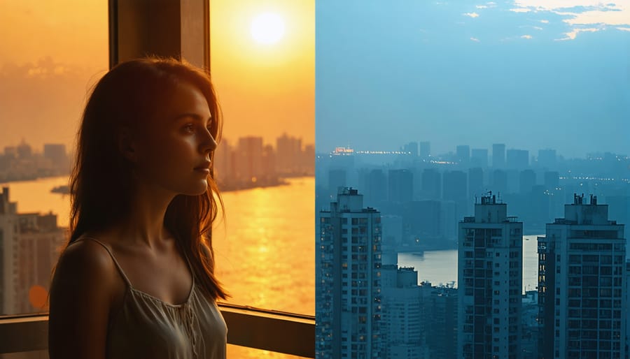
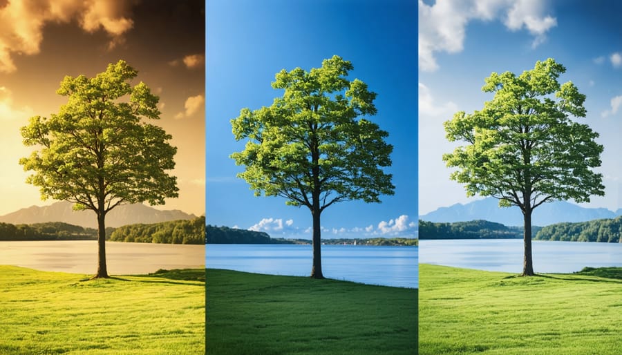
Color temperature plays a pivotal role in visual storytelling, with warm and cool tones creating distinct emotional responses in your viewers. Warm tones, like golden yellows, rich oranges, and deep reds, naturally evoke feelings of comfort, intimacy, and energy. Think of a sunset portrait where the warm light bathes your subject in amber hues, instantly creating a sense of warmth and nostalgia.
Cool tones, including blues, greens, and purples, tend to convey calmness, mystery, or melancholy. A misty morning landscape captured in cool blues can transport viewers to a place of quiet contemplation, while teal-tinted urban scenes might suggest a more contemporary, sophisticated narrative.
The interplay between warm and cool tones can dramatically shift your story’s mood. For instance, adjusting your white balance slightly toward warm tones can transform a standard indoor portrait into an intimate environmental study. Conversely, pushing toward cooler temperatures can turn a ordinary beach scene into a moody, dramatic seascape.
Consider using split-toning techniques in post-processing to enhance this contrast. You might keep shadows cool while warming up the highlights, creating depth and emotional complexity in your images. Remember that cultural associations with color temperatures can vary, so consider your audience when making these creative decisions. The key is to use temperature intentionally, making it serve your narrative rather than letting it be a mere accident of lighting conditions.
Color Harmonies That Tell Stories
Color harmonies are powerful storytelling tools that can instantly convey mood, emotion, and narrative in your photographs. When you understand how to use complementary colors (those opposite each other on the color wheel) and analogous colors (those adjacent to each other), you can create visual stories that resonate deeply with viewers.
Complementary color pairs, like blue and orange or purple and yellow, create dynamic tension and energy in your frames. Think of a sunset silhouette where the warm orange sky contrasts with cool blue shadows – this natural complementary harmony instantly communicates the drama of day’s end. Similarly, when photographing autumn scenes, the interplay between yellow leaves and purple shadows can emphasize the seasonal transition.
Analogous color schemes, such as combining yellows, oranges, and reds, create harmony and cohesion in your images. This approach works beautifully in portrait photography, where warm skin tones can blend seamlessly with carefully chosen wardrobe colors and backgrounds. In landscape photography, capturing the various green hues of a forest creates a sense of natural unity and peace.
To effectively use color harmonies, start by identifying the dominant color in your scene. Then, either look for its complement to create impact, or its analogous neighbors to build harmony. Remember that color relationships can be subtle – even a small pop of complementary color can anchor your composition and guide your viewer’s eye through the story you’re telling.
Essential Color Grading Techniques
Split Toning for Mood
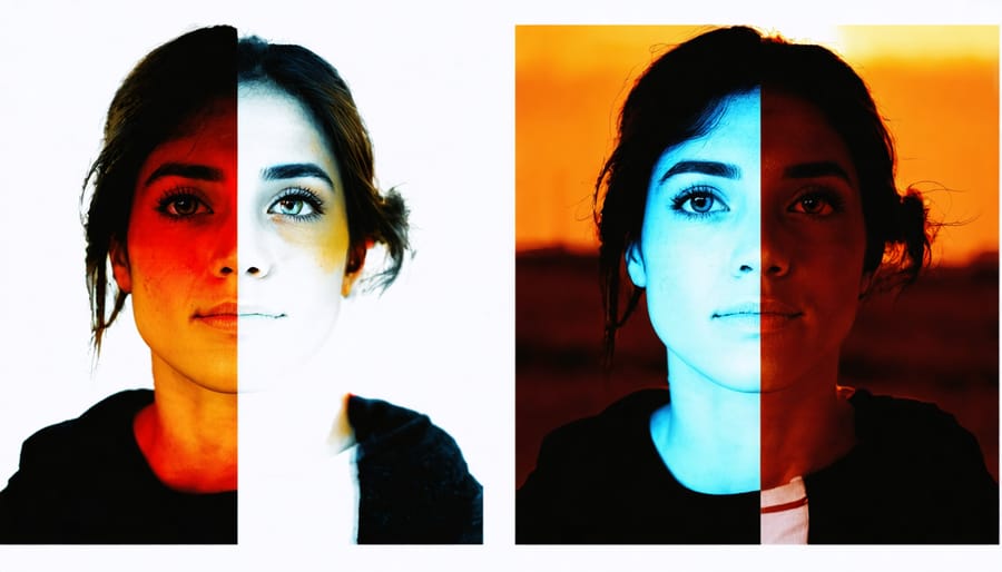
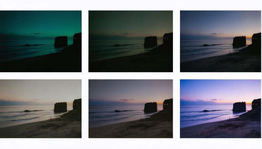
Split toning is a powerful technique available in most modern photo editing software that allows photographers to separately adjust the colors in the highlights and shadows of an image. This subtle yet impactful approach can dramatically transform the mood and emotional resonance of your photographs.
When working with split toning, think of your image as having two distinct color layers: one for the bright areas and another for the darker regions. For instance, adding warm golden tones to your highlights while cooling down the shadows with subtle blues can create a cinematic feel that draws viewers deeper into your story. This technique works particularly well in portrait photography, where warm highlights can enhance skin tones while cooler shadows add depth and dimension.
The key to effective split toning lies in restraint. Start with subtle adjustments – perhaps 10-15% saturation – and gradually build up the effect until you achieve your desired mood. A sunset photograph might benefit from copper-toned highlights and purple-tinted shadows, evoking a dreamy, nostalgic atmosphere. Similarly, street photography can gain an edgy, urban feel by incorporating teal shadows with neutral highlights.
Remember that different color combinations evoke distinct emotional responses. Warm highlights paired with cool shadows create tension and drama, while complementary colors can produce a harmonious, balanced feeling that guides your viewer through the image’s narrative.
HSL Adjustments
HSL (Hue, Saturation, Luminance) adjustments offer precise control over individual colors in your images, allowing you to fine-tune the emotional impact of your visual story. Unlike global color adjustments, HSL lets you target specific colors while leaving others unchanged, creating subtle yet powerful effects that enhance your narrative.
Consider a sunset photograph where you want to emphasize the warmth without affecting the cool tones in the shadows. By adjusting the orange and red hues, you can shift sunset colors from harsh to gentle, dramatically changing the mood from dramatic to serene. Similarly, tweaking the saturation of greens in a forest scene can transform it from lush and vibrant to muted and mysterious.
The luminance slider is particularly powerful for directing attention within your frame. Darkening the luminance of blue skies while maintaining their saturation can create a moody atmosphere without looking artificial. Alternatively, brightening yellow luminance in autumn leaves can make them appear to glow naturally.
When working with skin tones, subtle HSL adjustments can be transformative. Small changes to the orange and red channels can help subjects appear more natural or create stylistic effects while maintaining authenticity. Remember that less is often more – aim for adjustments that enhance your story without drawing attention to the editing itself.
Practice by identifying the dominant colors in your image and considering how their relationships affect your narrative. Sometimes, desaturating competing colors can make your main subject’s colors more impactful, creating a stronger visual hierarchy that guides your viewer through the story.
Selective Color Grading
Selective color grading is a powerful technique that allows photographers to guide viewers’ eyes to specific elements within an image by manipulating colors in targeted areas. Unlike global adjustments that affect the entire photo, this approach lets you enhance or subdue colors in precise locations, creating visual hierarchy and emotional focus.
Using advanced editing features, you can isolate particular color ranges or use masking tools to work on specific regions. For instance, you might warm up the skin tones of your subject while cooling down the background, creating a natural separation that draws attention to your storytelling focal point.
Consider a street photograph where you want to emphasize a red umbrella in a sea of commuters. By slightly desaturating the surrounding colors while maintaining or enhancing the umbrella’s vibrancy, you create a compelling visual anchor that supports your narrative. This technique is particularly effective when you want to convey mood or emotion through color contrast.
The key is subtlety – avoid heavy-handed adjustments that might make your editing obvious. Instead, aim for natural-looking results that guide viewers’ attention without them realizing they’re being directed. Start with small adjustments to specific hues, saturation, and luminance values, then fine-tune until you achieve the desired emotional impact while maintaining the authenticity of your scene.
Creating Consistent Visual Narratives
Developing Your Color Palette
Color plays a vital role in visual storytelling, acting as an emotional conductor that guides viewers through your narrative. Developing a cohesive color palette isn’t just about making images look pretty – it’s about creating a consistent visual language that reinforces your story’s mood and message.
Start by identifying the emotional response you want to evoke. Warm tones like oranges and yellows typically convey comfort and energy, while cool blues and greens often suggest calmness or melancholy. Consider how complementary colors can create dynamic tension, or how analogous colors can establish harmony within your frame.
When shooting, pay attention to naturally occurring color schemes in your environment. Urban scenes might offer a gritty palette of grays punctuated by neon signs, while nature provides harmonious combinations you can build upon. Look for recurring colors that can thread through your series, creating visual continuity.
In post-processing, tools like HSL (Hue, Saturation, Luminance) adjustments allow you to fine-tune your color palette. Consider creating custom presets that maintain your chosen color scheme across multiple images. However, remember that consistency doesn’t mean identical – subtle variations within your palette can add depth while maintaining cohesion.
A practical approach is to limit yourself to 3-4 dominant colors for a series. This constraint helps create a more focused narrative and prevents visual overwhelm. You might choose a primary color that appears prominently, supported by secondary colors that complement or contrast effectively.
Document your color choices using tools like mood boards or color swatches. This reference helps maintain consistency across shooting sessions and ensures your visual story remains coherent, especially for long-term projects. Remember that your palette should serve your narrative – if a color isn’t contributing to your story, consider whether it belongs in your scheme.
Test your palette across different lighting conditions and subjects to ensure it’s versatile enough for your needs while maintaining its core character. This approach helps build a signature style while keeping your visual storytelling clear and impactful.
Color Grading Presets and LUTs
Color grading presets and LUTs (Look-Up Tables) are powerful tools that can help you maintain a consistent visual style across your photographic narratives. When properly utilized as part of an efficient editing workflow, these tools can dramatically reduce editing time while ensuring your images tell a cohesive story.
Think of presets as recipe cards for your image editing. They contain predetermined adjustments for various settings like exposure, contrast, color balance, and tone curves. While many photographers start with popular preset packs, the key to developing your unique visual voice lies in customization. Start with a preset that approximately matches your vision, then fine-tune the settings to create your signature look.
LUTs take color grading a step further by precisely mapping color values from one space to another. They’re particularly useful when you want to achieve specific cinematic looks or maintain consistency across different cameras and lighting conditions. For storytelling purposes, consider creating separate LUTs for different narrative moods – warm, nostalgic tones for personal moments, cooler tones for dramatic scenes, or muted palettes for documentary-style work.
Here’s a practical approach to developing your preset system:
1. Create a core preset that defines your basic style
2. Develop variations for different lighting conditions
3. Save specific adjustments for common scenarios
4. Document your settings for consistency
Remember that presets and LUTs are starting points, not final solutions. Each image in your story may need subtle adjustments to maintain the intended emotional impact while fitting within your overall visual narrative. The goal is to create a consistent look that enhances your storytelling without becoming formulaic or restricting your creative freedom.
When working on a series or project, consider creating a specific preset collection that reflects the story’s mood and theme. This approach ensures visual coherence while allowing for natural variations that keep your audience engaged.
Real-World Applications
Portrait Stories
Color grading in portrait photography is like painting with light and emotion. The way you manipulate colors can transform a simple headshot into a compelling visual narrative that speaks directly to viewers’ hearts. When working with portraits, consider how different color temperatures affect the emotional resonance of your image.
Warm tones like amber and golden hues tend to evoke feelings of comfort, nostalgia, and intimacy. These work beautifully for family portraits or lifestyle shots where you want to capture genuine connections. Cool tones, on the other hand, can create a sense of mystery, melancholy, or sophistication – perfect for editorial or dramatic portraits.
Split-toning is a powerful technique where you apply different colors to the highlights and shadows. For instance, adding subtle blue to the shadows while maintaining warm highlights can create depth and dimension in your subject’s features. Pay attention to skin tones – they should remain natural-looking even as you adjust the overall color mood.
Consider using complementary colors strategically. A portrait against a deep blue background will make warm skin tones pop, while desaturating everything except key elements can direct attention exactly where you want it. Remember that subtle adjustments often work better than dramatic color shifts – your goal is to enhance the story, not overshadow your subject.
Documentary and Street Photography
Color plays a pivotal role in documentary and street photography, where authenticity meets artistic expression. When documenting real-life moments, photographers can use color to enhance the narrative without compromising the truth of the scene. The interplay of warm and cool tones can dramatically influence how viewers interpret and connect with the story being told.
Consider how the golden light of sunset can transform a mundane street scene into a powerful statement about urban life, or how the stark contrast of primary colors in a marketplace can convey cultural vibrancy. Documentary photographers often work with available light and existing color palettes, making it crucial to recognize and capitalize on naturally occurring color relationships.
When approaching documentary subjects, pay attention to color patterns that emerge organically. A vendor’s bright yellow fruit stand against a blue wall might tell a story about local commerce, while the muted tones of a rainy day can emphasize the mood of a social documentary piece. The key is to remain truthful to the scene while consciously using color to strengthen your visual narrative.
Remember that color choices in documentary work should support the story rather than overshadow it. Subtle color grading in post-processing can help maintain authenticity while enhancing the emotional impact of your images.

Visual storytelling through photography is an ever-evolving journey that combines technical expertise with creative vision. Throughout this exploration, we’ve discovered how powerful storytelling elements can transform ordinary images into compelling visual narratives that resonate with viewers on an emotional level.
Remember that successful visual storytelling isn’t just about mastering individual techniques – it’s about bringing together composition, lighting, color, and timing to create a cohesive narrative. Each photograph should serve a purpose, whether it’s capturing a decisive moment, conveying an emotion, or revealing an untold story.
As you continue developing your storytelling skills, don’t be afraid to experiment with different approaches. Try capturing a single story from multiple perspectives, or challenge yourself to tell complex narratives through minimal elements. The beauty of photography lies in its flexibility as a medium – there’s always room for personal interpretation and creative expression.
Practice is essential, but equally important is the willingness to step outside your comfort zone. Share your work with other photographers, seek constructive feedback, and study the visual narratives that move you. Analysis of both successful and unsuccessful attempts will help refine your storytelling abilities.
Keep in mind that some of the most powerful photo stories come from genuine connections with your subjects and authentic moments. Take time to understand the story you want to tell before pressing the shutter. Consider how each element within your frame contributes to the narrative, and don’t hesitate to simplify when necessary.
As you move forward, remember that visual storytelling is not about following rigid rules but about finding your unique voice and perspective. The techniques and principles we’ve discussed are meant to serve as guidelines rather than restrictions. Trust your instincts, remain curious, and continue pushing the boundaries of your creative expression.
Your journey in photographic storytelling is unique to you. Embrace the learning process, celebrate your successes, and learn from your challenges. The art of visual storytelling through photography is a lifelong adventure that rewards those who remain passionate and persistent in their pursuit of compelling narratives.